Page Experience Plays a New Role in Google Site Ranking
For those of us who’ve been designing digital destinations for at least a decade, there’s no question the average website today is at least ten times better than the average website when we first began. The ability to track and measure user experience has been a gamechanger for marketers of every size, and the metrics Google has promoted to help improve that experience have played a key role.
User Perceived Experiences
Google is now putting larger emphasis on “how users perceive the experience of interacting with a web page.” An ambitious undertaking to say the least – even for one of the most resourceful companies in the world.
Just as with their plan to prohibit third-party advertiser cookies (which was postponed), this new Page Experience initiative was announced last year. And while they began mixing new page experience metrics into their overall ranking recipe a few months ago, it won’t reach its full potency until at least the end of August. The rationale for this gradual rollout was that it will not only prevent panic and allow site managers time to institute new initiatives on their own, but also allow Google to monitor their systems for any unintended consequences.
Since the rollout in May, Google has provided additional tools and resources in their search blog that better explain their measurement methodologies.
Plenty of agencies and their clients are unsure of how these new page experience algorithms are going to affect their site rankings, and how to adjust SEO strategies accordingly. The truth is many factors of “page experience” are already taken into account by Google; factors like accessibility, load time and the like. But this new approach elevates their importance while adding several more.
What Really Matters?
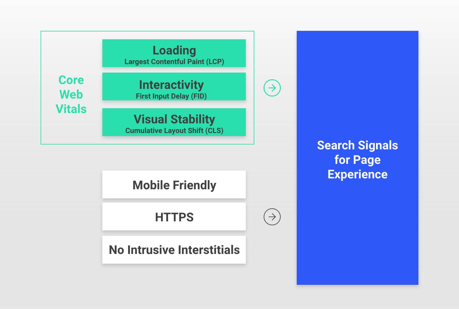
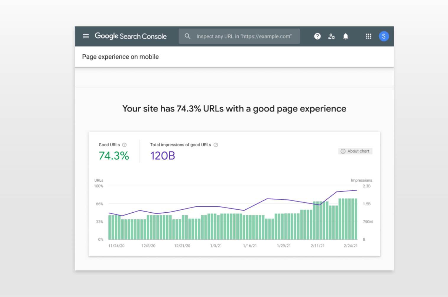
Google will continue to monitor several page experience signals, including their three Core Web Vitals metrics: First Input Delay (FID), Largest Contentful Paint (LCP) and Cumulative Layout Shift (CLS). But a new Page Experience Report in the Search Console provides additional insights regarding HTTPS security, mobile-friendliness, the absence of intrusive interstitials and – most intriguing – the percentage of site URLs with “good” page experience.
What Should We Do?
The good news is that good agencies like Modern Impact already pay plenty of attention to creating positive page experiences. It’s not just about the basics – like avoiding keyword stuffing and broken links. It’s about developing relevant content, higher contrast, intuitive navigation, mobile performance and a host of other reasons to return.
Some of these factors are simply functional, while others are more contextual, but they all focus on one critical objective: To create a user experience that strikes a balance between what’s good for your customer and what’s good for your company. Anyone can build a site designed solely to sell somebody something. But it takes real expertise, meaningful insight and professional discipline to build a destination that makes high-value prospects eager to buy.
In other words, it’s not easy, but it’s worth the effort. And while I can’t provide you with a long list of everything you should do (without negatively impacting your page experience), I can offer you a few suggestions regarding what you shouldn’t.
Don’t Be Rude
Good marketing is a conversation, and nothing ruins a conversation like constant interrupting. There’s no excuse for intrusive interstitials and other disruptive advertising that distracts the consumer and destroys the natural flow of their experience. Imagine if the grocery store required you to provide your contact info before you could walk down an aisle. You’d walk out and never return. You can still collect info – you can still sell stuff – as long as you do it in a respectful, relevant way. Setting actions-upon-exit is a simple example. Just try not to interrupt your guests.


Don’t Be Boring
Too many marketers still think of their sites as little more than digital brochures. With most consumers now shopping and buying a wide variety of products and services online, it’s critical to ensure every page of your site augments the traditional role of your sales or customer service team and moves users through their journey to the point of conversion. Colorful design, greater contrast, intuitive navigation and relevant content all contribute to that outcome (and are all part of Google’s new page experience metrics).
Don’t Be Sloppy
Poor graphic design is clearly a waste of money and typos are obviously unforgivable. But it’s amazing how many of the sites I visit still have broken links or 404-page notices. In addition to diminishing your overall user experience and brand reputation, they also destroy media efficacy. If the destination linked to your advertising fails, your media will be flagged and that investment is wasted. Worse yet, the prospect you were trying to persuade may also presume you don’t know what you’re doing. (Sound melodramatic? I’ll be happy to show you the data).


Don’t Be Stubborn
The market is fluid. The market is mobile. That means your consumer and the means by which you engage them are also evolving. The new page experience metrics from Google are just the latest in a long line of changes yet to come. So, once you’ve adapted, don’t imagine you’re done. This is a matter of perpetual methodology that requires a nimble mindset and constant innovation. It’s iterative, not prescriptive, and the nature of the technology suggests it always will be. If you’re not looking ahead at least two years, you’re probably behind the curve.
That’s what Google is doing. So, in summary, I’ll add that while it may sometimes seem impossible to keep up with every new guideline from Google, I believe their new emphasis on evaluating page experience is both positive and, perhaps, overdue. It’s been a key consideration in every digital destination Modern Impact has ever developed, and a key factor in our clients’ success.


