Part three of a three-part series on how we build cohesive and compelling campaigns at Modern Impact (We bet you’re as excited to see how this ends as GOT).
If you remember back to part one in the series (email design) or part two (digital display ads), the El Diablo brand manager assigned us to create awareness for their new product by having people take their hot sauce challenge. Now we need to send our web traffic somewhere to convert our visitors by providing a positive measurable experience. Enter the landing page design…
A campaign landing page does many things. It helps build your brand, provides details of the campaign, offers multiple ways for the user to see/interact with key information, and drives conversion to deliver on Key Performance Indicators (KPIs) – whether it’s through a form, a click-thru or even a shopping cart. You can also use a landing page for other guided actions, including:
- Building your email list
- Downloading free content
- Signing up for an event
- Lead generation etc.
- Promoting branded content, videos, etc.
Since we’ve defined our KPI as “getting users to sign up for the hot sauce challenge”, when we take the visitor to the landing page, we need to take them through the steps (using best practices) to create a smooth and intuitive user journey and guided brand interaction.
Think mobile first
According to statista.com, 4.57 billion people worldwide used a mobile phone in 2018. So, you can design a landing page to look fantastic on a laptop or desktop, but if it suffers on mobile you run the risk of “un-selling” your product – even damaging your brand. As everyday users, we see mobile-first webpage designs that look great on our phones and work properly. When we see one that is difficult to use or looks janky on mobile, our first instinct is to be annoyed.
At Modern Impact we always start with mobile design in mind to create landing pages and websites that are seamless and responsive. In addition to mobile-first design, here are some pointers for getting your targets to interact and convert:
Clear language
Use language that your target audience uses in conversation. Remember this landing page is not your website but it IS an extension of your brand. Make sure you’re using clear and branded messaging to create a stronger bond between your audience and product.
Clean design
It needs to look professional by using high quality photography, videography, typography and be stripped down to only the essentials within copy, navigation and buttons. Again, this is NOT your website – we are guiding the user to take a particular action. If the relevance of a piece of content is in question, you can probably cut it.
Call to action
The call-to-action indicates the specific action we want our visitors to take once landing on the page. Make sure this is prominent and repeat it several times throughout your landing page.
Now that we have the overall back-end planning taken care of, we’ll dive into the design of the page.
Headline
Just like in print, your headline is about 50 cents of your dollar. It needs to be captivating and enticing to a degree that people will want to read further into your page. Let them know why they’re here and engage them.
For our headline, since our target audience is the 25-45 year-old male market, we’re going to use a headline that resonates with them by using language they actually use…like “HOT-ASS SAUCE.”

Layout
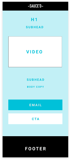
Again, we want to think mobile first when it comes to layout. We also want to keep it clean, quick and concise. Don’t forget, this is different from a website…this is not a page to scroll and learn “About Us” but a page made for a particular reason.
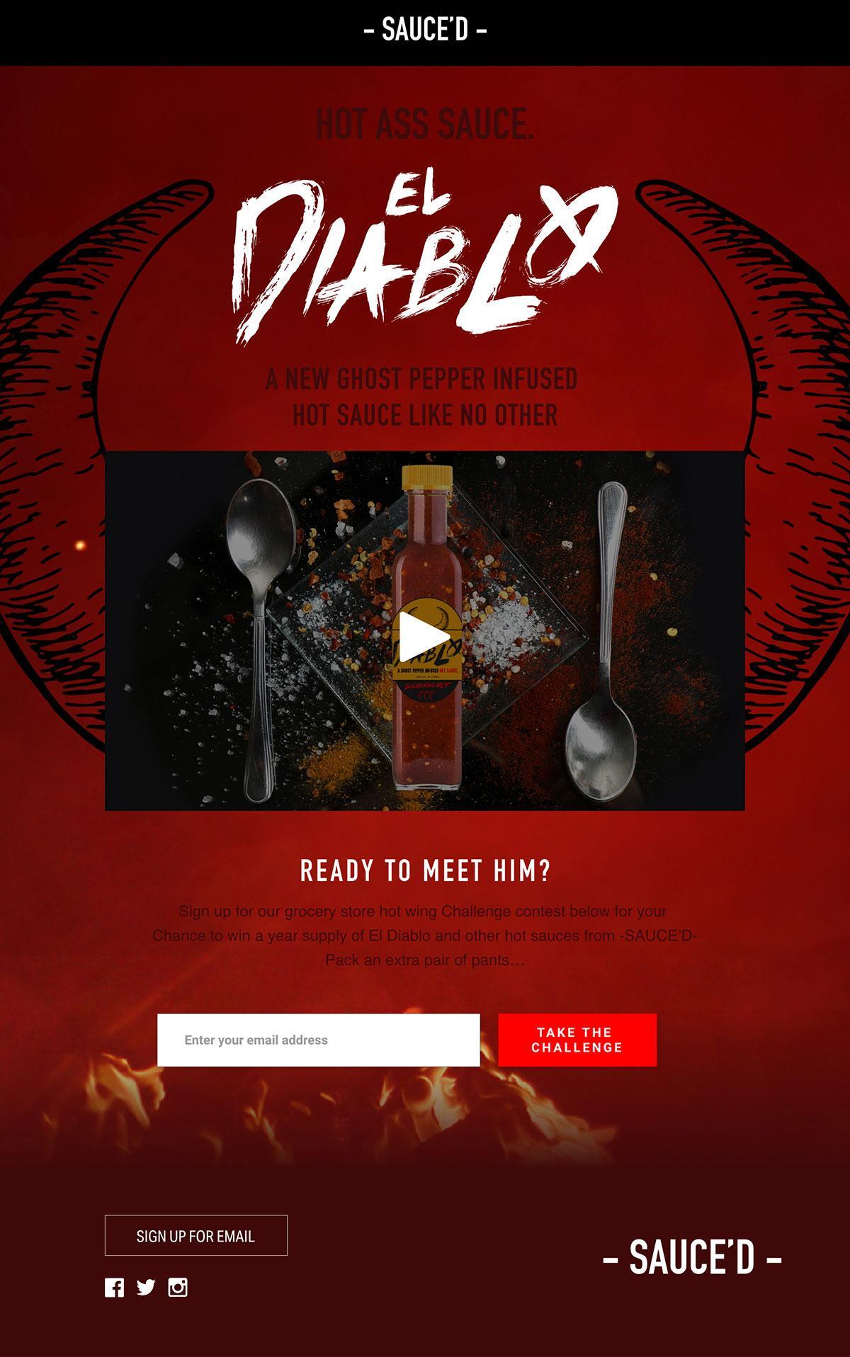
Since we want them to learn about our new product and sign up for the challenge, we are going to use a large brand/product introduction video for our above-the-fold-section (great way to communicate more information in a short segment) and continue with a CTA.
Visuals
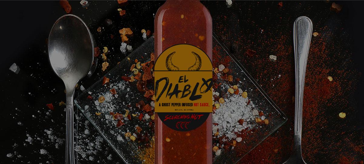
Of course, visuals need to be high quality and on brand. They also need to be campaign-specific.
For example – If you are selling an Orange Mocha Frappuccino at a gas station, but show only Blue Mocha Frappuccinos in all of your ads, there’s going to be a disconnect. Your blue drinks will lead to an orange landing page and your consumers will get a bad tingly feeling that something is off.
Make sure what you use in your content matches throughout the whole campaign…otherwise the gas station may burn down (search Zoolander clips if you don’t know what I’m talking about here).
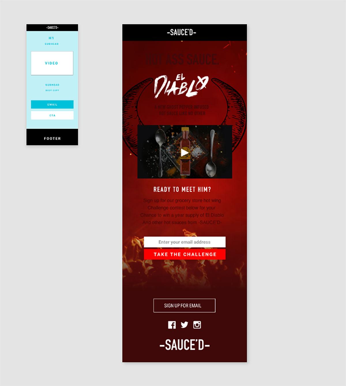
Here’s what our El Diablo design applied to the above layout would like like to connect the campaign visual layer to the selected layout.

At this point when all-of-the-above has been put into place, you’ll have one hot-ass landing page for one hot-ass campaign. Sit back and listen to your inbox ding with your targets signing up to see if they can take the heat.


