This is part two of a three-part series on how we build cohesive and compelling campaigns at Modern Impact.
Part Two: Digital Display Ads
In the first post of this series, we locked down our visual style for a targeted email campaign for our “El Diablo” client. Now, the client would like to expand the campaign to include digital display ads.
As we know, digital display is used for both brand messaging and promotions. Today, I’m going to break down how we build a cohesive campaign experience across the digital display landscape.
Layout:
First and foremost, we start with the layout of the message. For this campaign, it’s been established they want to further promote “El Diablo” to their growing fan base. Layout is very important here since we have very limited space to communicate. We also want to keep in mind, all display ads are basically mini billboards. The visual and content need to be visually pleasing, but also short and to-the-point.
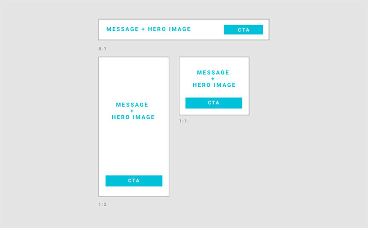
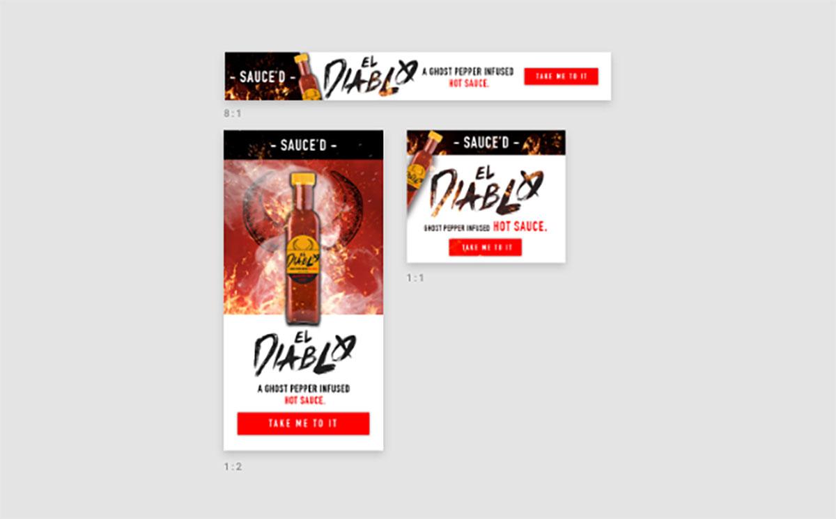
We use data analysis for everything – and effectiveness of display advertising is no exception. Using layouts proven to be effective at promoting click-through rates, we’ve designed the layouts below to present to the client. Also, by designing our display ads using correct aspect ratios, we’re able to quickly expand our ad size inventory to accommodate any device.

Copy:
To keep the campaign consistent across multiple touch points (and since the correct audience has previously been established) we’re going to use the same language and tone of voice as the email. This provides a cohesive brand experience and ties the full campaign together.
Visuals:
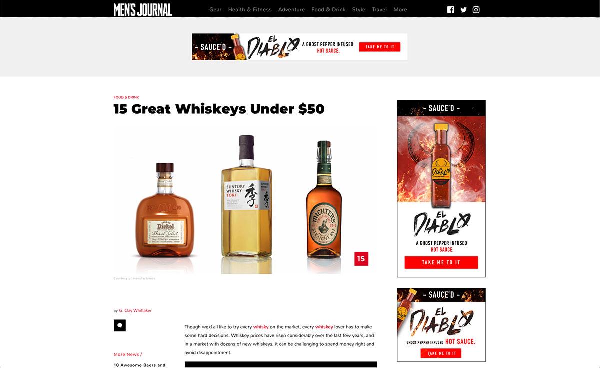
As you can see above, our ad spaces are not very big. Again – just like mini billboards. By using visuals that are aesthetically pleasing and having copy that is quickly digestible, we’ll be able to make an impression and create interest among our targeted audience.
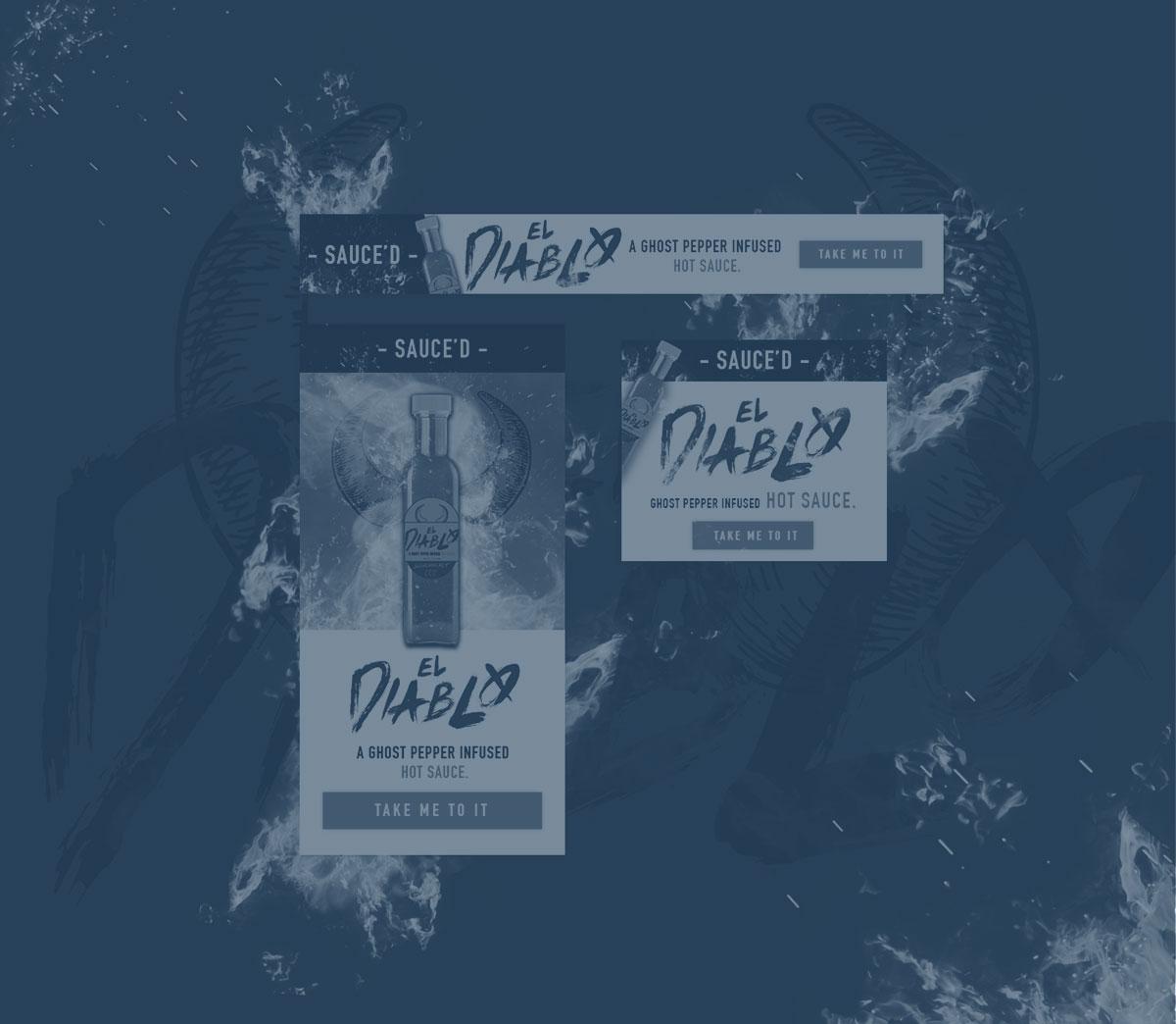
To build brand consistency, we make sure to stick with the brand guidelines with everything from image style to typography to messaging.

Example of different layouts we would consider using depending email objective.

Now, we’ve got our email and display ads that create a cohesive brand experience for our target audience. All we need now is the campaign landing page (the “payoff”), which we’ll go over in the final part 3 of this “Crafting A Hot Ass Campaign” series. Look for it to drop later this year!


